22.12.10

:TRANSMISSION: Holiday New Wave dance party

NEWWAVE
I made this the same day I made the Smiths posters and also the Thanksgiving Eve poster. So, it had barely been thought about as far as a name goes. I sent it to Jake and he said it was fine as is (so I never got to add on the official title--"Christmas Wrapping", which woulda looked awwwesome....).

You know me, I can never be away from retro for long. I decided to make this look jazzy, hip, modern, but also nostalgic and warm. Classic mid-century modern colors are that crisp teal blue with bold red and seafoam green. Since we're talking about "new wave," I figured I might as well make the colors flow together because that's what I do for music. It started to look like a painting from that era and also had some resemblance to Alexander Calder's mobiles. (Too lazy to find anything specific but this should be sufficient). I love the colors. It's so fresh and bright and festive. Hopefully the night (which is actually 6 hours from when I'm typing this) will be as rad. Yes, I'm calling my own work rad!

:JAGER: "Bubbles"

JAGER_NYE
I got a message last Monday from one of the dudes who runs Clubhouse Jager (which regularly hosts Transmission every week) saying they needed a flyer for New Year's Eve. I was like "totally!" because despite my strong ties to them, I hadn't been asked to do a poster for them before (they do tons of stuff besides Transmission, of course). They wanted something elegant and minimal, that felt nocturnal. He also included a few pictures of twinkle lights but when they're super out of focus. The effect was easy enough to create in InDesign, and from there, I just had to figure out the type. I've been using Coronet a lot lately, ever since I acquired it. It's retro, it's classy, and it's versatile for a script. I liked how it has a slanted feel, so I decided to go with that for the rest of the copy. Plus as one might tell from looking over my most recent work, I'm getting tired of generic alignments. All the type together also created kind of an arrow effect. Doesn't really have any significance, but it's cool.

I also did the ticket design for this event (much like last year's Transmission event), but my Creative Suite is unavailable and I didn't make a .jpg of it. It basically looks exactly like the poster; you're not missing out.

6.12.10

:WEDDING: Emily & Derek's Invitations

IMG_3173
Emily is my big sister. She got engaged to Derek in May and I asked immediately if I could do her invitations. It took quite a while to actually start, because there was some uncertainty about what kind of look and style she wanted. Eventually I just whipped something up and it worked out. She's as traditional as I am un-traditional, so it was interesting to find a way to achieve something that was elegant, formal and classy, while also being modern and a bit hip. Not only that, but this style is a good base for anyone (and it looks good in any color).
IMG_3177
IMG_3174IMG_3175
I offered to not only design everything, which included the invitation, an RSVP card, and a pair of maps, but to print them all out as well. Wow. That was quite an undertaking. My biggest project ever, and most backbreaking by far.
IMG_3186
The Epson WorkForce 1100
I got the Epson WorkForce 1100 for my birthday last year and it proved itself to be very valuable for this project. I used nice, heavy 140 lb watercolor paper and it prints like a dream. Archival quality ink, too. I had some issues with Epson a few times, and I'm still a little peeved at them, but not taking it out on the printer. The Printer is a rockstar.
IMG_2550
IMG_3185
For these types of project obviously it's extra good to have a self-healing cutting mat, a cork-backed ruler, and a utility knife (razor blades work, but your fingers will not thank you.)
IMG_2574
Although it does seem to happen no matter what.

Me after 3 hours of cutting out the maps.

Me after 1.5 hours of cutting out the inviations.

After folding, and double-sided printing, and cutting, and lots of BS with epson.... It was an extremely exhausting process, but I'm proud of myself that I was able to pull it off. I did everything myself, and that's pretty awesome. Would I do it again? Yes, but it would have to be for a lot of money.

4.12.10

:HANDSOME DEVIL:

"Handsome Devil" cover
This project was quite huge, and took about 4 weeks of good hard work to achieve. I'm in the end stages of my Graphic Design degree at school, which means we finally have classes where we make portfolio-worthy pieces. This particular project was a 24-page (I did 30) catalogue on anything we wanted to do, with basically no limitations when it came to the design. It was a good idea, though, to do something we were somewhat passionate about, and had access to images of. I called my friend Nicholas Smith up, who is a very fervent collector of vintage clothing and accessories, and asked if I could use him and his collection for my catalogue. He agreed, and we went to work. It started out as being I would take pictures of entire outfits and feature one per spread, but that was going to be too much work in such a short amount of time. So, I did just ties, and really found no lack of them (he has some 50 ties just from the 1960's alone).
"Handsome Devil" excerpt
I conceptualized the entire catalogue, took all the photos, edited them, and so on. I love circles, as we all know, and here I took extra care to display what they also meant for fashion. These are vintage ties, and vintage is very big right now. Our society has a way of recycling trends, and things coming full circle and I believe that history is a wheel. There was no other option than to use the circle. Not only to carry that theme through, but to give pops of color to the photos which I decided would be black and white and grainy (a choice I sometimes regretted when I had a picture that looked awesome in color).

It wasn't very hard after making the first spread. If you want a large catalogue to be consistent and thorough and smart, it's actually very simple: make a template and stick with it. I'm pretty proud of myself for this, and I couldn't done it without the help and companionship of my friend Nick.

SEE THE ENTIRE CATALOGUE HERE

(p.s. "Handsome Devil" is the name of a Smiths song.)

:TRANSMISSION: Electric Dreams


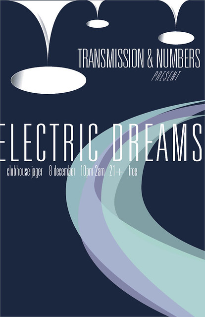
My friends, this is the one that almost made me cry. Yeah yeah, one of my OWN designs made me short of breath. Gave me that little thud in the pit of my stomach. I admit that when this thing all came together, I was blown away by it. Every so often I proclaim a new poster my favorite, or my best. I think this is my favorite and ONE of my best. I'll tell you why.

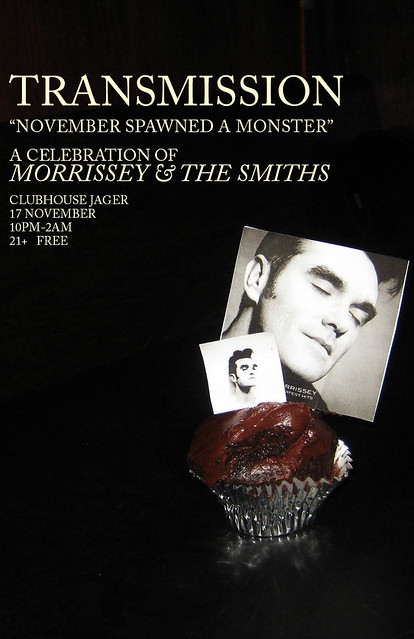
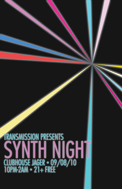
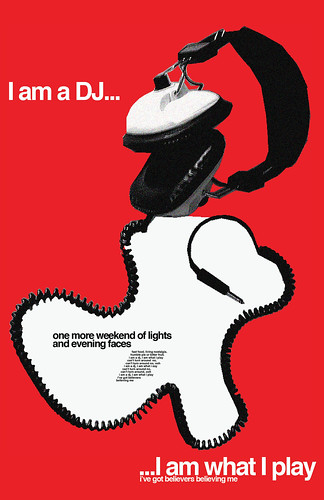
Jake tells me he has to miss the first two hours of Transmission on December 8, and the DJs from "Numbers" (a monthly 80's dance night now at Club Jäger) will be taking over the first. Numbers is much more synth-laden than Transmission, so it's going to be a synth-heavy night. If I thought my Synth poster was cool, it has nothing on this. Since the night was to be called "Electric Dreams," I wanted the poster to feel surrealistic and futuristic (in fact, Jake said to do something "futuristic" initially). Of course, I couldn't do something futuristic in the traditional sense. I wanted it to be 60's and 70's space age futurism. That was a pretty swell time in design, almost up there with mid-century modern.

Now. I've always seen retro illustrations that recreate that shadowy look, but not a perfectly smooth gradient. Kind of rough-looking, like it was painted on.
Observe the Starbucks 2010 holiday cups:


Anyway. I never knew how to accomplish that affect. I considered emailing design bloggers and asking them, but then I figured, I could probably make a gradient in illustrator and apply photoshop affects to it. I used the "water paper" filter to my gradients and got it pretty close to what I wanted. So, I made some modular white spheres that have no real purpose except to look futuristic and surreal. Without the bases, they look silly. WIth the bases and upside down they look pretty awesome. The wavey colors were just vectors I did in Indesign with transparencies on them. Look a bit like Saturn's rings, only icier.

Univers is a pretty awesome, universal type in terms of achieving modern and retro feels. I took the very thinnest weight, adjusting the tracking, and voila. I didn't really have a plan for the type until I just started playing around with it (this is basically true for everything I do) and when I placed in "Electric Dreams," that's when it happened.

This is my favorite because I fall into it every time I look at it. It's sleek, it's wintry and synthy, surrealistic and different from things I've done, but also along the same vein; it's very much my work. I think it's one of my best because I had an idea, didn't know quite how to execute it, but explored and felt around until I figured it out. It has a built quality that I think is impressive, and I think I used all my elements and the space efficiently and smartly. I explored new techniques and stepped outside my comfort zone (a bit. let's be honest here). I used new colors and type treatments. I think I matured with this one, as I feel I mature with all my posters.

It's simple and straight-forward, but I'm absolutely in love with it.

:TRANSMISSION: Thanksgiving Eve 2010


This is the big one, alright. Not quite as cool as my last year's one, but still kinda fun and retro lookin'. I did this one up quickly, as I knew I wanted to base it off of this:

but in, you know, autumnal colors.

And of course, I love graphics that represent sound and motion, and circles. I fricken love circles.

I'm afraid I don't have much more to say about it.

:TRANSMISSION: November Spawned a Monster


Well well well. Here I am again, after an unofficial blogging hiatus. I really should blog as often and frequently as possible. I have a bunch of stuff to catch up on (surprise). Here we go with what now has gone down in history as my favorite Transmission ever. Jake told me we needed a theme night before the infamous Thanksgiving Eve Transmission at the end of November. I tried to think, but he's done everything this year. Then I remembered that a Smiths/Morrissey night hadn't happened in a year, so I suggested it to him and he's like "Yeah! Make a poster that looks like a Smiths album" (Not sure what those look like? Direct yourself HERE).

I don't like using photos that I haven't taken, so I found this funny one I took of Jake last year during a Transmission. Smiths album cover photos usually have little relevance to anything except that they're people Morrissey like. That's pretty much the case here. Jake liked it, but thought it might be perceived as vain if we used a picture of himself. Pfft. Luckily I was on such a designers high I made another one with a picture I also took at my birthday party this year:

Yeah, someone made me Morrissey cupcakes. This still worked out fine for the theme, but I didn't love it as much. This one became the official poster but Jake paraded the other one around anyway.

And like I said, best Transmission ever.

15.10.10

:TRANSMISSION: Dark Entries


The Cure night almost wasn't going to happen, and this would've been the sole goth-y night at Transmission in October. Luckily, Jake decided to go with The Cure (which meant I got to use the poster I'd already made), and think of something different for this night. Like last year's Transmission Halloween, this one is named after a Bauhaus song. I didn't know the name of the night before I made this, so I just did something that felt like Goth and Post-Punk and minimal. I was really feeling October when I made it, basically. I don't know why, but Futura is a great "dark" font without being grunge, which seems to happen a lot, I've seen (at least with Goth nights in Minneapolis).

In terms of the design itself, I drew inspiration from the following:


Which, when you look at all those, you might wonder if I ever come up with anything on my own. Well, I do. It's not like I keep one image open and constantly look to it when I'm in InDesign. I simply draw bits of ideas from several things and blend it. That's what creative problem solving is all about. When I see something that inspires me, I not only save it to a folder on my computer, but I somehow lock it away in my brain, so that when I need to come up with an idea, I can just open the filing cabinet in my brain and pull something out pretty quickly.

Anyway, the whole Bauhaus movement was also a huge influence here. It makes sense, after all (and I think Bauhaus couldn't have chosen a better name for their band).

This took about 10 minutes and I did it to relax after dealing with a bunch of business-type BS all day. It's great that my escape from work is more work.

:BRIT'S PUB: 20 Years of Brit's


So this is kind of a cool thing. I got the nod from Jake (obv) to do a poster for this free event at Brit's Pub at the end of October (a halloween party that coincides exactly with their 20th anniversary).

For someone like me (a raging Anglophile), Brit's Pub is a paradise, and I'm always happy to do work for a place like that (who not only PAYS me, but gives me a gift certificate to their bar).

I've been, like, the busiest person ever lately with school and basically feeling like a small business owner. I did a first draft of this poster pretty quickly one day, and it was fine, but, admittedly, shite. It looked gimmicky, and I think part of me knew what I was doing. I didn't have a ton to work off of, as far as guidelines. Jake suggested the Union Jack in black and orange, and the Brit's 20th Anniversary logo. I don't have a copy of the original version anymore, but I kind of made it look 1800's Naval/Pirate-y. I sent it along, and was told to make it "sexier, edgier." In a moment of desperation, I asked Jake to tell me what to do, since I was feeling so creatively stretched.

He told me to maybe do some silhouettes, which I was very hesitant to comply with because I feel like I have done it to death. Instead, I decided to ditch my current fonts, and switch to something sexy and slim, and hell, why not a diagonal alignment. It was hard trying to work the logo in on a slant, but I ended up making work.

If I may be perfectly honest and abandon all modesty, I think this is probably my best typographical work ever. I love the font choices I made, and the two alignments that separate the performers info from the rest of it. The logo is prominently featured at top (another thing they requested) and I still kept the union jack, though smaller, and it doesn't look bulky or tacked on. I feel the alignment (on a slant) makes the whole thing much more interesting but still easy to read. I wish I could use this template for everything. I'm glad to do it for a venue who will display it, and one that I like so much. Not only that, but Solid Gold is awesome, and it makes me giddy to have made something with their name on it.

Stuff like this really makes me proud to do what I do.

:TRANSMISSION: In-Between Days: A Night for The Cure


This was supposedly Jake's first-ever night dedicated to The Cure, which I find shocking. They're such a great band that has such a huge impact on the night. He first alluded to the night in the Summer time, which excited me, and provoked me to do this poster early on.

The Cure were one of the first bands to do the Goth thing. I wanted to play to that look, since I really LOVE the music they made during that phase. For some reason, Goth is heavily associated with victorian dress, so I made a sort of old fashioned Victorian style poster with a silhouette of Robert Smith (whose hair is really that ridiculous). I had those little vector flourishes leftover from a couple years ago, and figured they'd go well.

I originally was probably going to do something more, with a baroque-style background, just super fussy and ancient looking. But, I think my OCD would get the best of me in that situation and I'd end up editing everything.

19.8.10

:TRANSMISSION: Synth Night

TRANSMISSION- Synth Night
Finally, I'm all caught up! This is a night that hasn't happened yet. Jake emailed me a couple days ago saying he was doing a Synth Night in September. I mentioned before that I'd had a design all ready in case there was ever a Synth night. Well, he did a Synth night but didn't require a poster so i used the design I'd done for something else (SEE: Eno poster). SO... When another Synth night came up, I felt a brief moment of "Aghh!" but then remembered I'd just seen something the day before that I thought would make an excellent illustration, and just happened to fit really well with the Synth theme:

This is a friend of mine's current profile picture on Facebook. I put that into illustrator, traced the lines (because I wanted that pattern exactly) and used an outer glow effect on them. I then did that with the type. Pretty simple, and still has the Caroline Royce Design mark upon it. I LOVE Synth music.

:VITAMINWATER ZERO: Flourish

Vitaminwater ZERO presents: Flourish
I got an email from local freelance fashion writer/stylist Jahna Peloquin about a fashion show presented by Vitaminwater ZERO. They wanted a poster done, and her description was something "whimsical, elegant, like an abstract sketch of a woman from the 40's" or something. So, I that's what I literally did.

I wasn't going to be able to sketch out what I wanted to by hand. I looked up some images from google and found one. I then used my wacom tablet in photoshop to trace a rough yet elegant sketch of her. I was going for something much like Garance Doré does with her fashion sketches. Photoshop wasn't quite good enough to achieve this look. Plus, it would turn out lo-res and gross. On a whim, I decided to see what would happen if I put the .psd file into Illustrator and did a live trace. The results were surprisingly perfect. It made the lines clean, dramatic, stylish, and best yet: hand-drawn.

The swooping colors were based off of some vitaminwater flavors. It modernized it a bit, and also looks like my work. My boyfriend also pointed out that it looked like a runway. I was like, "oh yeah! duh!"

This was for a big deal client. I didn't get paid, but I did get some pretty sweet compensation:


:TRANSMISSION: John Hughes Tribute

TRANSMISSION- John Hughes Night
This is essentially the one year anniversary of me doing Transmission posters. I started out with John Hughes and now I've come full circle. Oh how I've grown!

Anyway, this is a bit of a shame, because it's a pretty poster but because Jake wanted me to use that picture, it's horribly pixelated.

:PERSONAL: Jake's Birthday

Jake's Birthday
I don't know where I'd be without Jake and his generosity. He has done nothing but put his good faith in me, introduce me to people, flaunt my work, etc... I decided I would try and repay him with a custom poster for his birthday.

Since he is a DJ, and loves him some Bowie, I decided to go with a bit of inspiration from the song "D.J." It's just perfect. I was going for an old headphone ad--probably anywhere from the late 50's-early 70's. It's not super specific. Especially since they didn't make headphones like that in the 50's or 60's. Nor was this song even written in the early 70's (it's 1979, for your information). Anyway, I based it off of a 50's furniture ad, down to the diagonal type. The only issue is the lo-res stock headphone photo. I probably could've taken my own, but that would've been a LOT of work.