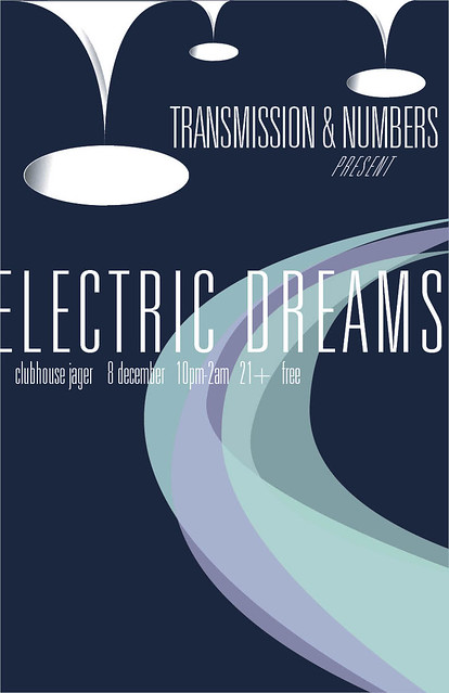
My friends, this is the one that almost made me cry. Yeah yeah, one of my OWN designs made me short of breath. Gave me that little thud in the pit of my stomach. I admit that when this thing all came together, I was blown away by it. Every so often I proclaim a new poster my favorite, or my best. I think this is my favorite and ONE of my best. I'll tell you why.
Jake tells me he has to miss the first two hours of Transmission on December 8, and the DJs from "Numbers" (a monthly 80's dance night now at Club Jäger) will be taking over the first. Numbers is much more synth-laden than Transmission, so it's going to be a synth-heavy night. If I thought my Synth poster was cool, it has nothing on this. Since the night was to be called "Electric Dreams," I wanted the poster to feel surrealistic and futuristic (in fact, Jake said to do something "futuristic" initially). Of course, I couldn't do something futuristic in the traditional sense. I wanted it to be 60's and 70's space age futurism. That was a pretty swell time in design, almost up there with mid-century modern.
Now. I've always seen retro illustrations that recreate that shadowy look, but not a perfectly smooth gradient. Kind of rough-looking, like it was painted on.
Observe the Starbucks 2010 holiday cups:

Anyway. I never knew how to accomplish that affect. I considered emailing design bloggers and asking them, but then I figured, I could probably make a gradient in illustrator and apply photoshop affects to it. I used the "water paper" filter to my gradients and got it pretty close to what I wanted. So, I made some modular white spheres that have no real purpose except to look futuristic and surreal. Without the bases, they look silly. WIth the bases and upside down they look pretty awesome. The wavey colors were just vectors I did in Indesign with transparencies on them. Look a bit like Saturn's rings, only icier.
Univers is a pretty awesome, universal type in terms of achieving modern and retro feels. I took the very thinnest weight, adjusting the tracking, and voila. I didn't really have a plan for the type until I just started playing around with it (this is basically true for everything I do) and when I placed in "Electric Dreams," that's when it happened.
This is my favorite because I fall into it every time I look at it. It's sleek, it's wintry and synthy, surrealistic and different from things I've done, but also along the same vein; it's very much my work. I think it's one of my best because I had an idea, didn't know quite how to execute it, but explored and felt around until I figured it out. It has a built quality that I think is impressive, and I think I used all my elements and the space efficiently and smartly. I explored new techniques and stepped outside my comfort zone (a bit. let's be honest here). I used new colors and type treatments. I think I matured with this one, as I feel I mature with all my posters.
It's simple and straight-forward, but I'm absolutely in love with it.


No comments:
Post a Comment