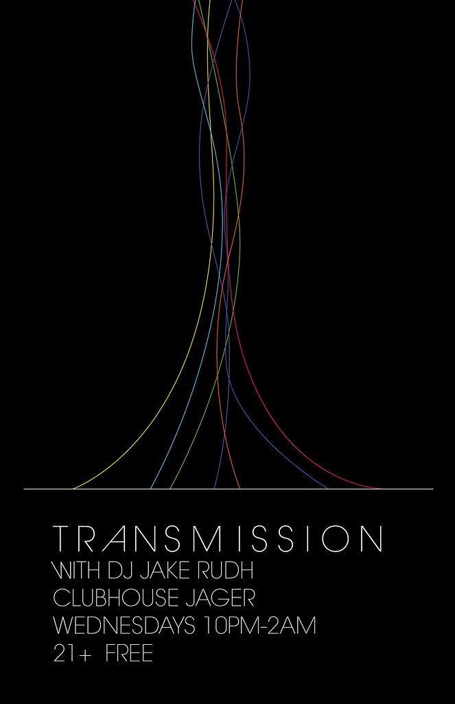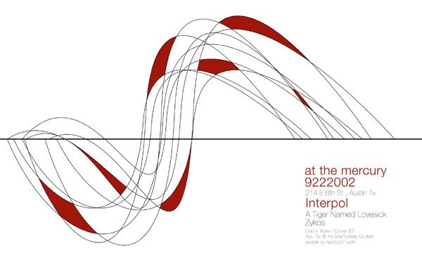
I can't remember exactly what inspired me to make this poster. I think it was probably a combination of this:

(which is continuing to influence me.. Not that, what, a month? is that out of the ordinary)
And the acquisition of one of the most exquisite fonts in existence: ITC Avant Garde Gothic.
Seeing that Interpol poster made me want to do something simple, with clean lines that expressed movement AND the illusion of sound. I also thought that I might want to use it for a Joy Division-themed poster someday.
But alas, I got impatient.
I don't have a lot of color in my everyday life. But I do design with it. It's so expressive, and when used minimally, it can have a really strong impact. TRANSMISSION is a night of sound and movement. I like the idea of visually communicating sound waves. So, that's what I did here. It did start out as something slightly more complicated and over-thought, so I toned it down, so to speak. Those damn colored strands were much trickier than they may appear.
I gave it to Jake as a printed piece, saying simply he could do whatever he wanted. It was mostly a little gift to him for letting me do design for him.
And he agreed that it did have a Joy Division essence.


No comments:
Post a Comment