
Here is the one I feel I've been waiting for as long as I've been the designer for Transmission.
I recently wrote on my other design blog a love letter to a very important figure in my life. Peter Saville, who, I've mentioned before, was the graphic designer for Factory Records, doing all the artwork for Joy Division and New Order, as well as many others. If you care to read the other blog I linked to, it would save me from having to reiterate what an impact the album cover for "Unknown Pleasures" had on me, as both a designer and a music fan, both of which are very very important things in my life, especially right now.
I also learned recently that right when Peter Saville was out of college, he asked Tony Wilson if he could do a poster for The Factory Night at the Russell Club (before they moved to the Hacienda), and that's how he got the job. All he did was ask. I could relate to that, because I asked Jake if I could do a Transmission poster, then I did, and he hasn't let me go yet. I kind of think of myself as the Peter Saville of this city, as Transmission is a night built largely upon the music that emerged from the Manchester music scene in the 70's and 80's. Obviously, the scale is significantly smaller, but there are still vague parallels...
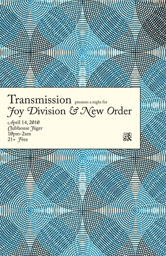
That's why this poster was sooooo difficult to conceptualize. It had to be perfect, and I wanted to pay homage to Peter Saville like I have other times. This poster currently is the 5th or 6th try at an idea. The only thing that stuck with me the whole way through was the color scheme. I wanted black to represent Joy Division, and Blue to represent New Order. NOT because they have a song called "Blue Monday," but because their music is such a contrast, melodically, to Joy Divison's. Even though they are comprised of the same people. Obviously, the most stark contrast to Black is white, but I wanted it to be colorful, because New Order is colorful music and Joy Division is not.
Next, I thought about the album covers I knew and loved. There is no direct inspiration for this poster, but I thought something classic-looking was the best approach, since both bands were rather cutting-edge and ground breaking in their technologies and song-writing capabilities. I made one circle out of many circles to begin, and then went from there, creating a pattern, which kind of looks like flowers, but also--as Jake pointed out--transmission signals (Hey! That's the name of the night! And the name of the Joy Division song the night was named after!). The classic type (Adobe Caslon Pro, which has some BEAUTIFUL glyphs), was a juxtaposition to the cold, structured look of something that conveys technology. So, with that, I achieved an homage to the album cover for Power, Corruption and Lies, where the classic painting of flowers is juxtaposed with the colored bars in the corner.
I was at school when I did it, after perusing the Wink Inc site, I came across this packaging:

And I knew that's what I was going to do. Honestly, though, I didn't notice the type on the label so much as the graphic itself. I barely viewed it for a second before I went to work. This poster also inspired in me a deep love for Adobe Caslon Pro, and its amazing Glyph palette.
I hope Peter Saville would be proud of me.

No comments:
Post a Comment