
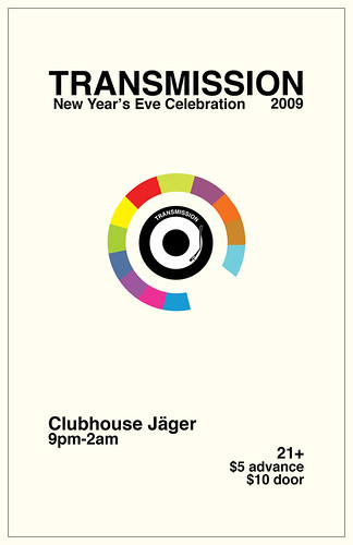
This one was both easy and hard. Sort of fun, but also stressful. I had been thinking about the New Year's for a while, and how I wanted to use a circle (seriously, I love circles) because of the ball in Times Square. It's a near-universal event that's associated with New Year's Eve. Next, I wanted to pay homage to a graphic designer that has influenced me many times, and was also part of a scene that Transmission is very much based upon, Peter Saville.
The main graphic is almost stolen directly from this. I didn't make it quite as geometrically immaculate, but it works either way. Really the only direction I got from Jake was to use the Transmission logo, which I incorporated into the colorful graphic. I used Helvetica Bold, obv. There are 12 colors used, for 12 months, and the gap is supposed to be December 31. Obviously nobody is supposed to deduce that just from looking at it, but it's there, and it's purposeful. At least I can't be accused of not thinking it out.
I think maybe it was a bit risky to make it so, so simple, especially for a big glitzy night. To be sure, it was met with some hesitation, and the whole thing was almost scrapped, but I was very insistent, and possibly even a little diva. I wanted this to work, and eventually I was able to submit this as my final design. I haven't yet heard anything negative about it, so I'm hoping that it's (still) a good design. I think if I had sat on it longer, I could've come up with something that was still in this vein, but with even more visual impact. I've actually thought of a few things that I could've done, too. Another time, another time.
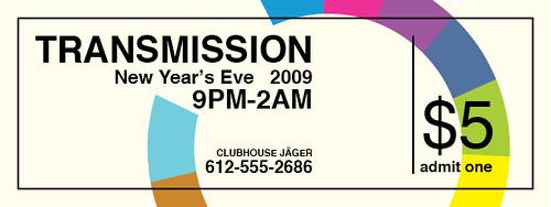
ALSO I designed the ticket for the event. Another reason I really fought for my original design was because it went so well on the ticket:

No comments:
Post a Comment