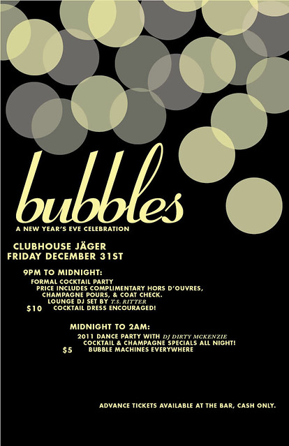
I got a message last Monday from one of the dudes who runs Clubhouse Jager (which regularly hosts Transmission every week) saying they needed a flyer for New Year's Eve. I was like "totally!" because despite my strong ties to them, I hadn't been asked to do a poster for them before (they do tons of stuff besides Transmission, of course). They wanted something elegant and minimal, that felt nocturnal. He also included a few pictures of twinkle lights but when they're super out of focus. The effect was easy enough to create in InDesign, and from there, I just had to figure out the type. I've been using Coronet a lot lately, ever since I acquired it. It's retro, it's classy, and it's versatile for a script. I liked how it has a slanted feel, so I decided to go with that for the rest of the copy. Plus as one might tell from looking over my most recent work, I'm getting tired of generic alignments. All the type together also created kind of an arrow effect. Doesn't really have any significance, but it's cool.
I also did the ticket design for this event (much like last year's Transmission event), but my Creative Suite is unavailable and I didn't make a .jpg of it. It basically looks exactly like the poster; you're not missing out.


No comments:
Post a Comment