
A good rule of thumb is to always keep in mind the format you're designing for. We never print out the Transmission posters; they are always viewed in web. So, This looks pretty cool online. In print, I must admit, it looks pretty boring.
Boring even for me, and I love boring things.
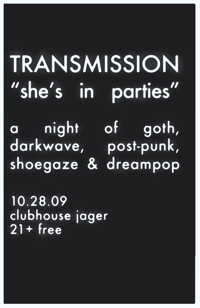
But, I really love this poster. Jake gave me the assignment early on; a gothy Halloween night. He said: Think Bauhaus or Joy Division. I've never listened to Bauhaus, but I decided to use them as inspiration.
When I think of them, I think of the one song I know by them: "Bela Lugosi's Dead." And from the knowledge I gained watching Ed Wood, it gave me enough to know he was a silent film star--Dracula, to be exact. Any student of film should know that, duh. So. Silent film era. I wanted to make a poster that resembled a silent film title card. I googled that, and found this gem:

I also kept in mind what I know about Joy Division's music, which is that it's very minimal and detached; sparse. So, this bit of inspiration was perfect: minimal, dark, ominous and gothic.
I chose a good sans serif that'd been around in the 20s (Futura Medium), and put it on a not-exactly-black background, with a not-exactly-white border. I justified the type because I couldn't help but notice that was also done to my inspiration source. It was a bit too crisp, so I applied a noise filter in photoshop (they can actually be useful sometimes), and used the airbrush tool to give the type a nice eerie glow. It was definitely back to basics on this design.
But again, it only has impact online. Trust me.

No comments:
Post a Comment