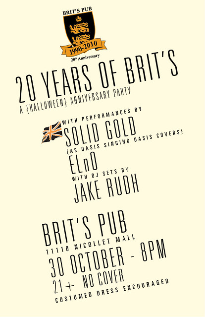
So this is kind of a cool thing. I got the nod from Jake (obv) to do a poster for this free event at Brit's Pub at the end of October (a halloween party that coincides exactly with their 20th anniversary).
For someone like me (a raging Anglophile), Brit's Pub is a paradise, and I'm always happy to do work for a place like that (who not only PAYS me, but gives me a gift certificate to their bar).
I've been, like, the busiest person ever lately with school and basically feeling like a small business owner. I did a first draft of this poster pretty quickly one day, and it was fine, but, admittedly, shite. It looked gimmicky, and I think part of me knew what I was doing. I didn't have a ton to work off of, as far as guidelines. Jake suggested the Union Jack in black and orange, and the Brit's 20th Anniversary logo. I don't have a copy of the original version anymore, but I kind of made it look 1800's Naval/Pirate-y. I sent it along, and was told to make it "sexier, edgier." In a moment of desperation, I asked Jake to tell me what to do, since I was feeling so creatively stretched.
He told me to maybe do some silhouettes, which I was very hesitant to comply with because I feel like I have done it to death. Instead, I decided to ditch my current fonts, and switch to something sexy and slim, and hell, why not a diagonal alignment. It was hard trying to work the logo in on a slant, but I ended up making work.
If I may be perfectly honest and abandon all modesty, I think this is probably my best typographical work ever. I love the font choices I made, and the two alignments that separate the performers info from the rest of it. The logo is prominently featured at top (another thing they requested) and I still kept the union jack, though smaller, and it doesn't look bulky or tacked on. I feel the alignment (on a slant) makes the whole thing much more interesting but still easy to read. I wish I could use this template for everything. I'm glad to do it for a venue who will display it, and one that I like so much. Not only that, but Solid Gold is awesome, and it makes me giddy to have made something with their name on it.
Stuff like this really makes me proud to do what I do.


No comments:
Post a Comment