19.8.10
:TRANSMISSION: Synth Night
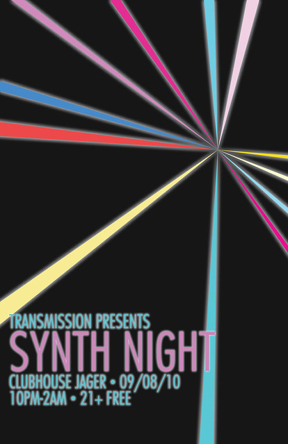
Finally, I'm all caught up! This is a night that hasn't happened yet. Jake emailed me a couple days ago saying he was doing a Synth Night in September. I mentioned before that I'd had a design all ready in case there was ever a Synth night. Well, he did a Synth night but didn't require a poster so i used the design I'd done for something else (SEE: Eno poster). SO... When another Synth night came up, I felt a brief moment of "Aghh!" but then remembered I'd just seen something the day before that I thought would make an excellent illustration, and just happened to fit really well with the Synth theme:
This is a friend of mine's current profile picture on Facebook. I put that into illustrator, traced the lines (because I wanted that pattern exactly) and used an outer glow effect on them. I then did that with the type. Pretty simple, and still has the Caroline Royce Design mark upon it. I LOVE Synth music.
:VITAMINWATER ZERO: Flourish
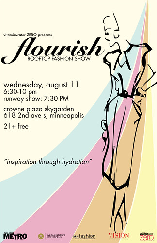
I got an email from local freelance fashion writer/stylist Jahna Peloquin about a fashion show presented by Vitaminwater ZERO. They wanted a poster done, and her description was something "whimsical, elegant, like an abstract sketch of a woman from the 40's" or something. So, I that's what I literally did.
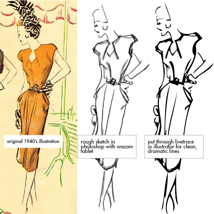
I wasn't going to be able to sketch out what I wanted to by hand. I looked up some images from google and found one. I then used my wacom tablet in photoshop to trace a rough yet elegant sketch of her. I was going for something much like Garance Doré does with her fashion sketches. Photoshop wasn't quite good enough to achieve this look. Plus, it would turn out lo-res and gross. On a whim, I decided to see what would happen if I put the .psd file into Illustrator and did a live trace. The results were surprisingly perfect. It made the lines clean, dramatic, stylish, and best yet: hand-drawn.
The swooping colors were based off of some vitaminwater flavors. It modernized it a bit, and also looks like my work. My boyfriend also pointed out that it looked like a runway. I was like, "oh yeah! duh!"
This was for a big deal client. I didn't get paid, but I did get some pretty sweet compensation:
:TRANSMISSION: John Hughes Tribute
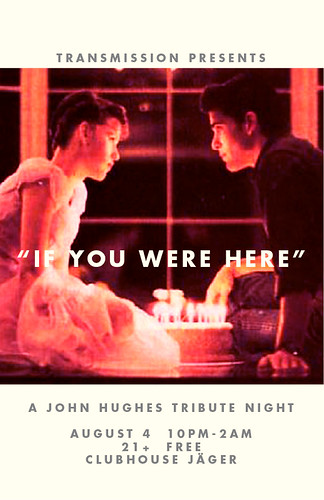
This is essentially the one year anniversary of me doing Transmission posters. I started out with John Hughes and now I've come full circle. Oh how I've grown!
Anyway, this is a bit of a shame, because it's a pretty poster but because Jake wanted me to use that picture, it's horribly pixelated.
:PERSONAL: Jake's Birthday
I don't know where I'd be without Jake and his generosity. He has done nothing but put his good faith in me, introduce me to people, flaunt my work, etc... I decided I would try and repay him with a custom poster for his birthday.
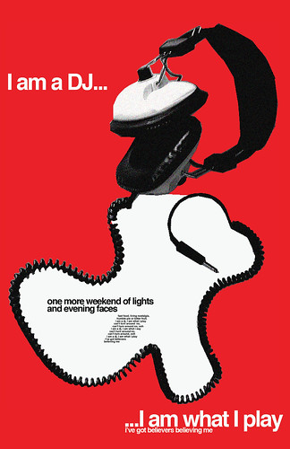
Since he is a DJ, and loves him some Bowie, I decided to go with a bit of inspiration from the song "D.J." It's just perfect. I was going for an old headphone ad--probably anywhere from the late 50's-early 70's. It's not super specific. Especially since they didn't make headphones like that in the 50's or 60's. Nor was this song even written in the early 70's (it's 1979, for your information). Anyway, I based it off of a 50's furniture ad, down to the diagonal type. The only issue is the lo-res stock headphone photo. I probably could've taken my own, but that would've been a LOT of work.
:MAD MEN SEASON PREMIERE PARTY 2010:
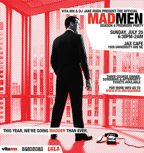
Oh I loved this project. They did this party last year and I made a pretty valiant effort of making a poster for them before I realized that it was actually a big deal. Suffice it to say, since Jake is involved in this, I got to do it this year. Score! It's a freakin' show about Ad Men in the 1960's. How up my street is THAT?!
This was also very difficult though. The request was to use the official Season 4 poster, which was only available to me online in lo-res, and since this was going into print... You can see my dilemma. Well, I did what I could and adjusted the resolution as much as it would allow. I figured putting some photoshop filters would be the way to get my aesthetic, and also solve some of the issue with the graininess. It worked for the first one, the second one had to be even bigger, and that posed a huge problem. I'll admit, it didn't look the GREATEST in print, but I know I did everything I could, so I guess there's no use getting my panties in a bunch.
Would Don Draper be proud? Or would be possibly patronize me? I think probably both.
:MUSIC: Summer Breeze
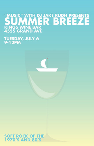
"Summer Breeze" was basically just another Yacht Rock night. I don't know, I didn't check it out. I figured... Warm colors that were also refreshingly cool. Jake pitched the idea of a couple sharing a glass of wine (second time he brought that idea up) but I thought it might be busy, plus I couldn't find anything to model it off of (you think I just free-hand those silhouettes?!). I stuck a boat in a glass of white wine, and it went over well.
This would turn out to be my last MUSIC gig. Another talented local designer and musician, who is also a friend of Jake's and loves this kind of music, offered to do a poster for the subsequent night, and eventually Jake asked me if I wouldn't mind letting him do all of them from now on. I figured, as long as I get to keep working for Jake on every other project he requires, then I can let this one go. I started it out, gave it a logo, did the first few posters, and that's good enough. I have no problem giving this job to someone who is as passionate about the music played at MUSIC as I am about what's played at Transmission.
:THE NILES FILM FILES:
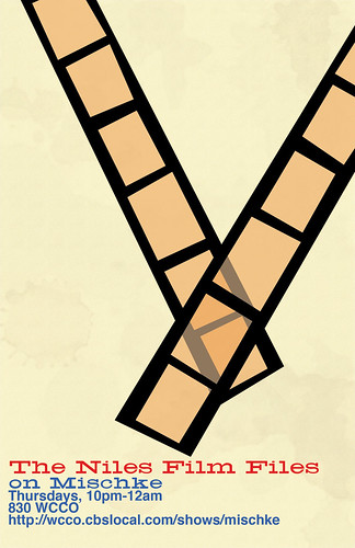
Niles is a friend of mine, who is insanely smart when it comes to movies. A columnist and radio host in town, T.D. Mischke, became acquainted with him and he is now a weekly guest to talk film. Basically I asked him if he wanted a poster for this little gig and he said "hells yeah." I wanted to use my Hellenic Rip-off "Hefty" to give it my signature retro style, and did some simple illustrations of filmstrips.
:2010: June
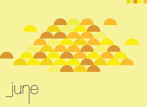
I made the half circles too big. It's not supposed to look like a pyramid. Just kinda... Abstractly Summery.
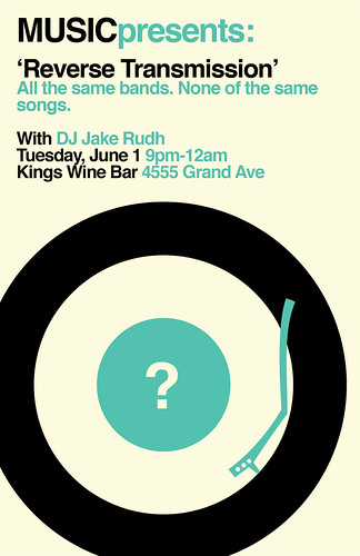
:MUSIC: Reverse Transmission
This one was pretty cool. All the bands I love at Transmission but different songs. I sat at the bar for most of the night talking to Jake and basking in cool music with pals and a glass of wine. I took the Transmission logo, changed the colors, and put a question mark in the middle (Jake told me to do that). From there I just used those colors for the entire thing. Not overly conceptual. Just plain and simple.
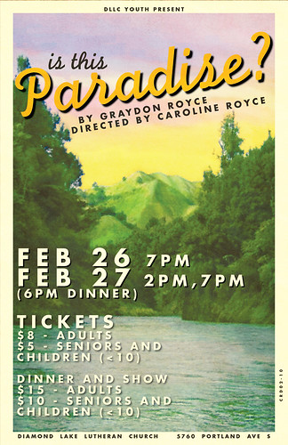
:IS THIS PARADISE?:
"Is This Paradise" is a play my dad wrote years ago that was performed at my church. I was a Freshman in High School. For the church play this year, he recycled this one and I directed it, which also meant I could design the poster anyway I wanted to. I really wanted it to look like an old postcard. I don't have a lot of fancy fonts, so I had to work with what I had. The picture is one I took in New Zealand, though heavily photoshopped to look dreamy and hand-drawn (or however they did it back then). Futura was a given, as it speaks heavily to me of retro style. It's pretty great, and I decided to be cute and put a little date stamp on the side that looks like a serial number of some sort (CRD02-10).
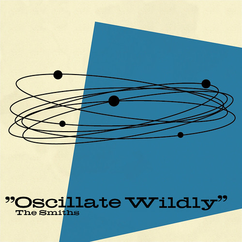
:PERSONAL: Oscillate Wildly
Old-timey sixties design, mixed with a little bit of cosmic imagery, and an excellent song to match. I love me some Smiths!
:2010: May
I'll admit, I've gotten very very lazy with these things. It's almost the end of August and I have yet to do July.
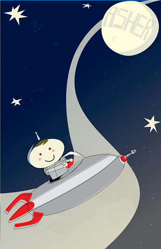
:PERSONAL: Asher's First Birthday
Asher is my cousin Lauren's baby. He turned 1 in May and since I just adore the little guy so much, I thought I would make him a customized poster. Little boys want to be astronauts don't they? And I love Space anyway. I was sitting at a Twins game, and rather than thinking I could make him a little ballplayer, I got the idea for Space somehow. I think something to do with the fact that the Twins play in an outdoor stadium now, I caught myself looking at the sky one too many times.
It's kind of a throwback to the fascination everyone had with Space in the 1960's. And I put his name in the moon, of course. It was hard to get the gradient right but everything else turned out pretty well. I printed it on 140 lb stock with my Epson WorkForce 1100. Beautiful. A mix of lullabies accompanied it. (MY style of lullabies i.e. Bowie, Lou Reed, Velvet Underground, etc...)
:TRANSMISSION: Mind the Gap
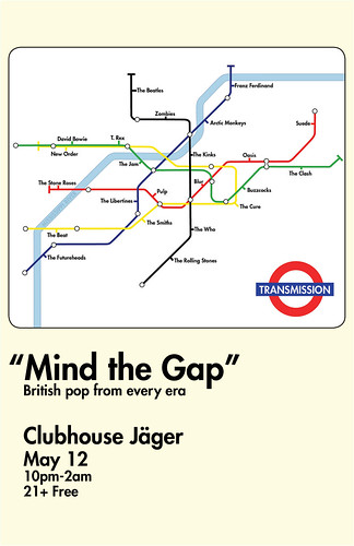
Oh, British Pop. So wonderful, so diverse, so classic and cool. I swear, forever and ever, I had this idea of using a roundabout sign as inspiration if Jake ever decided to do a Brit Pop night. Then Jake told me about the night and I was like "Yes! This is it! I can finally make the roundabout." But then he gave me the title: "Mind the Gap." Which is perfect and all, but it wouldn't have made sense with my idea. So it got scrapped.
Luckily, I love maps of trains; especially the London Underground. I've always wanted a reason to make my own. AND, it fit perfectly with the theme of "Mind the Gap."
I took the actual Underground map and traced over it in Illustrator. It was kind of tedious, and almost back-breaking, but not at all work I despised. I asked for a list of British Pop bands from the last 50 years, and decided each "track" would represent a decade, making each "station," or "stop" a band. Pretty nifty right? The map was oddly sized, though, so I really had to scale it down to fit it in the poster. I gave it a rounded border, and did a nifty visual pun with the Underground Logo and adapting it to Transmission.
I ended up using this project as my final assignment that I presented in my Adobe Illustrator class. Easy as pie, and the teacher loved it. Clean and modern, she said.
:MUSIC: Left of the Dial
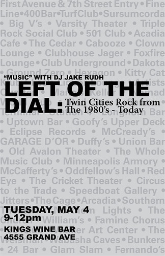
"Left of the Dial" is a Replacements song; and The Replacements are from MN. This was a local music night Jake put on with music. He wanted it to be familiar to people, and suggested basing it off of the First Avenue Logo:
The background is a list of music venues in the Twin Cities. It was going to be stark white at first, but the names of all the venues kind of drowned the title of the night. Although.. I wonder how it would've gone to invert the color scheme. Hm. I guess I'll never know.
:SCHOOL: DAM Club Meeting
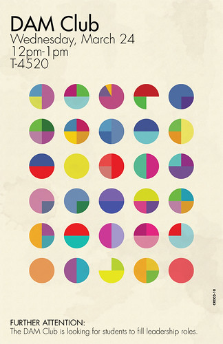
The DAM Club is the design group at school. Every month they have a meeting, and different students design posters for it. I did this one for March (which, I think this meeting ended up not even happening, and it was taking place two days after we got back from Spring Break... And I got the assignment.. You guessed it, right before Spring Break).
Not a whole lot to say. I did this thing with the circles some time before and just plopped it into the poster. I really love it. I just wish I hadn't used those circles now for something that barely got seen. It could be a Transmission poster or something. Meh.
Subscribe to:
Posts (Atom)