
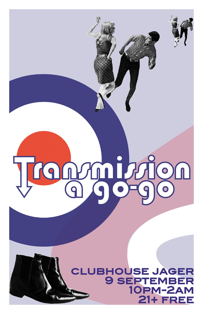
I was really, way too excited when Jake told me he was doing a mod night. I already knew exactly what to do, because a few weeks prior I spent a good couple hours looking online, collecting pictures of Mods. And, I had a lot to live up to after the John Hughes poster. I knew I wanted to use this as my inspiration:
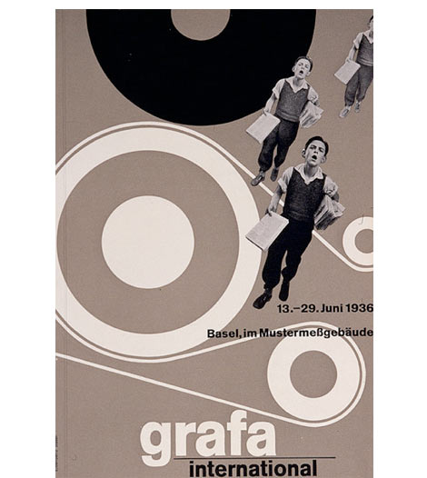
I loved the repetition of the photograph, and the interesting movement of the shapes. Admittedly, this IS a poster from the 30's. But, I can definitely see the modernism in there. Swiss designers in the 1930s were cutting edge. Obviously--they are still influencing people.
Anyway, I struggled with the right image to use and to repeat. I made a version with a woman but Jake sent me a photo he liked and that people associate with him. It was tough--being that it was so small, but luckily it worked out. I just wish now I would've put a duotone on them instead of a black & white filter. Oh well.
Working on the type was also a bit of a struggle. I'm self-taught, mind you, so applying strokes and making character outlines for me was a journey. I associate the arrowed-type with the mid-60s. The original font was Bauhaus. One of my instructors said today that every font has a purpose. And while I normally don't like the Bauhaus font, it definitely had its place here.
Oh, and Beatle boots. You can't go wrong with those.

No comments:
Post a Comment