Most of the work on here IS fairly recent. But I'm now moving into even more recent territory. I can't help but think I'm evolving with each and every design. I think lately I've just been in a good groove.
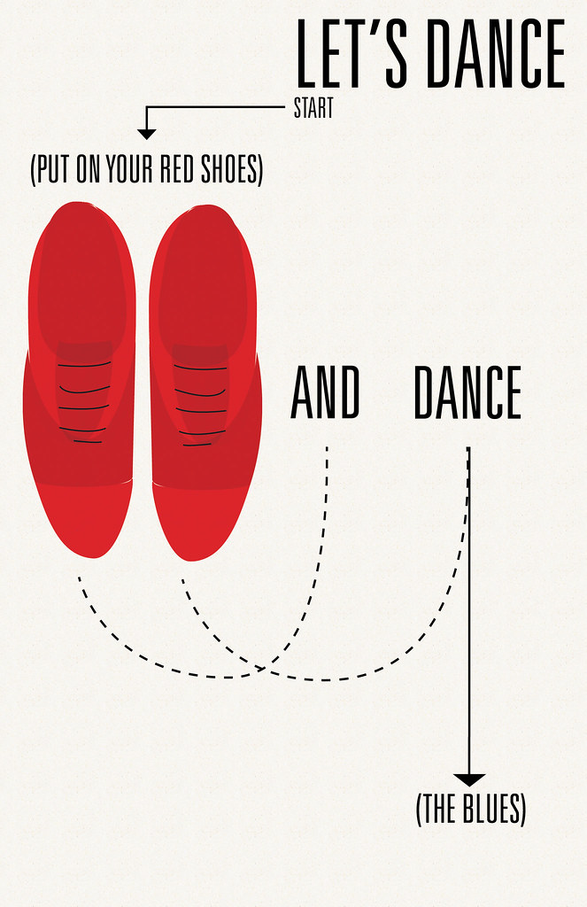
Speaking of groove. I love David Bowie. I wanted to make a poster similar to the (Good Day, Sunshine) one, with a simple "Let's Dance" and the illustrated red shoes. But, I figured, why not make it a bit more kitschy? Dance step diagrams are great and simple, and yes they are design. Whether you think so or not. I actually used a diagram done by Andy Warhol for reference--which is cool, because Bowie loved Warhol, and he even played him in a movie. So after that was just finding a good balance. With this amount of stuff in a design, it doesn't work to center it, so I had to find a way to even out both sides. And NOT have a big gaping hole in the right-center. In any case, it was fun as hell to do it. You might be able to tell, I love the 60s. It was a great era of design.


No comments:
Post a Comment