20.10.09

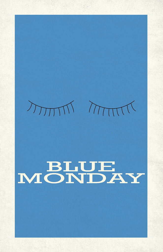
:PERSONAL: Blue Monday


Not sure why I wanted to portray this very 80s dance song in a retro 60s poster design, but I just did. It was simple, took about 15 minutes. Although, I hoped for a bit more effect on the type. It's supposed to look like it went through an offset press. It's a bit hard to make out.

New Order is good.

:PERSONAL: Space Oddity


I feel like talking about this design would take more energy than it did to make it. It wasn't hard. On the contrary, it was SO much fun. But it just took a long time, and it took even longer to get a solid concept.

I started with making a stream of colored blocks. But the colors looked stupid and the blocks didn't have a good flow. I tried over and over with them. Then I started making a big color chart in illustrator--I got a bit sidetracked. But it sort of gave me a bit more focus, and I thought I better just do what I know--and I went back to the colored lines. But it wasn't going to be enough of an impact, so I made three of each color.

Wait, wait... I'm getting ahead of myself.

The concept I wanted was a 70s-era Sci Fi cover of David Bowie's Space Oddity. The font again is Avant Garde and the lines give a sense of cosmic journey. The background I fashioned out of photoshop brushes and a paper texture. The little man? Also a brush. But I'm not sure where I got this from, I just think having a little ambiguous character gives it that 70s vibe. Don't ask me why, because I don't have much evidence for that.

It all sort of formed organically. I didn't even start out with this idea in mind. It WAS going to be something different, and I'm glad I changed it. I'm really proud of this. The only thing I regret is that it's not FOR anything. It's simply there to be seen by anyone who comes across it. Designing for personal enjoyment is a double-edged sword.

Although if I do generate enough interest, I'd love to sell this as a print.

And "D.R. Jones" is David Robert Jones aka David Bowie. Duh.

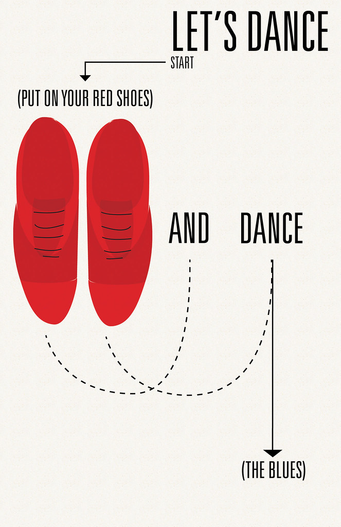
:PERSONAL: Let's Dance


Most of the work on here IS fairly recent. But I'm now moving into even more recent territory. I can't help but think I'm evolving with each and every design. I think lately I've just been in a good groove.

Speaking of groove. I love David Bowie. I wanted to make a poster similar to the (Good Day, Sunshine) one, with a simple "Let's Dance" and the illustrated red shoes. But, I figured, why not make it a bit more kitschy? Dance step diagrams are great and simple, and yes they are design. Whether you think so or not. I actually used a diagram done by Andy Warhol for reference--which is cool, because Bowie loved Warhol, and he even played him in a movie. So after that was just finding a good balance. With this amount of stuff in a design, it doesn't work to center it, so I had to find a way to even out both sides. And NOT have a big gaping hole in the right-center. In any case, it was fun as hell to do it. You might be able to tell, I love the 60s. It was a great era of design.

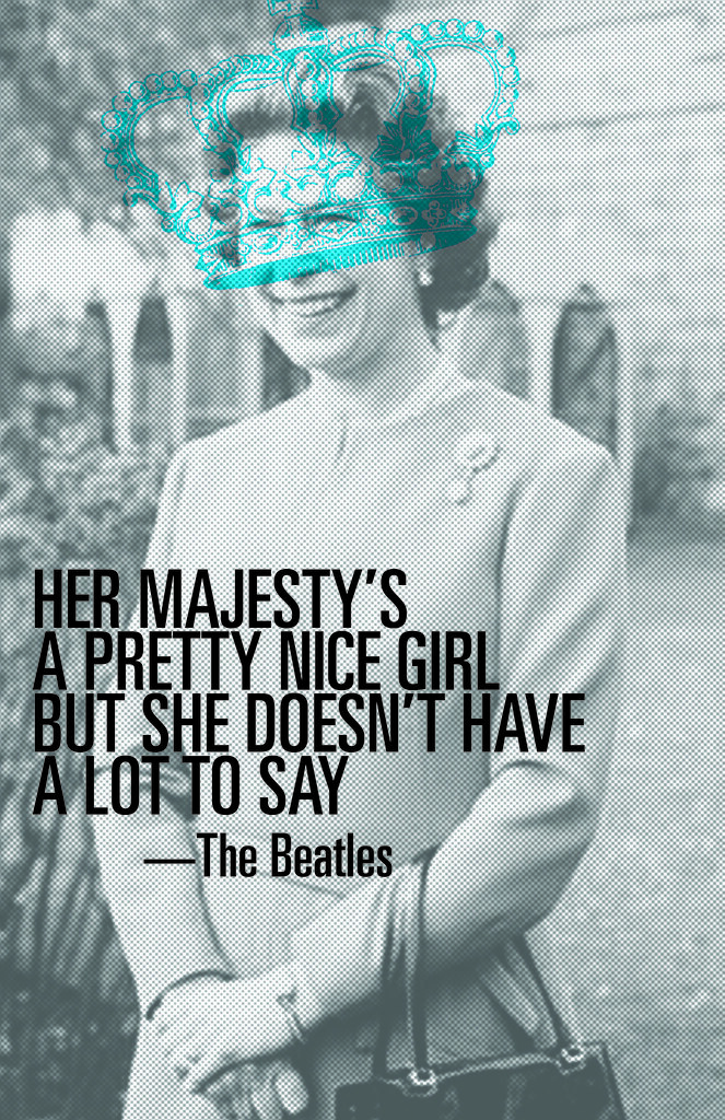
:PERSONAL: Her Majesty


To say I am an anglophile would be an understatement. I am an angloMANIAC. I probably care a bit too much about the British Royal family for being an American. I also love The Beatles, AND my logo is a Queen's crown. Sooo what better way to combine the three than to make a design? It looks like it's screenprinted, jah? Well, that's intentional. Also, putting a half-tone filter on the image makes it look less pixelated... Which it was, because I had to make it so big.
I also made this around the same time as the Good Day, Sunshine one. Can you tell? I love Univers.

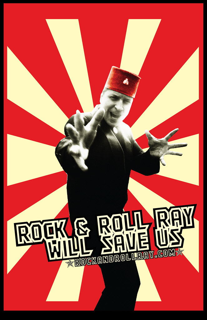
:ROCK & ROLL RAY:


The man is a legend in Minneapolis. And if people don't know him, they should. Ray is a great friend of mine. I wanted to make this for him just 'cause. He needs something epic and intimidating.
Also I LOVE, love love Soviet Propaganda. This doesn't quite hold a candle to the original stuff, but I may work on it a bit more.

:PERSONAL: Good Day, Sunshine


There's not too much I'll say about this. I just really love designs with big solid shapes; specifically circles. They're minimal but make a big impact.
I made this for my little sister who just moved to college. And this is (one of her) favorite Beatles song. Still, I hope.

Ta-da.

:UPTOWN THEATER: Shaun of the Dead at Midnight


Ah, Shaun of the Dead. It is my favorite movie ever. Seriously, EVER. I won't go into that here, but I will say I was quite excited when the ultra-cool Uptown Theater in Minneapolis was doing a midnight showing for "-of the dead" month (October). I'm friends with a good number of the employees there, so I asked if I could make a poster. Ohh yeah. I'm not exactly sure why, but I wanted a 60s influence in there somewhere. I wanted to go as far as have the whole thing illustrated in the style of Shag, but I'm not quite skilled enough for that. So, I did it with the title of the film. Good enough.

The blood splatters were my favorite part. I got them a couple different places on DeviantArt, as well as the folded paper background. The movie still was simply taken from a movie cap. It's actually a perfect image, because it has the red tie, which went with the design, and the cricket bat, which, to me, is iconic to the film.

And, I didn't plan this, but if you look at the design from far away, it makes a big "Z." Get it? Z for Zombie!

:TRANSMISSION: she's in parties


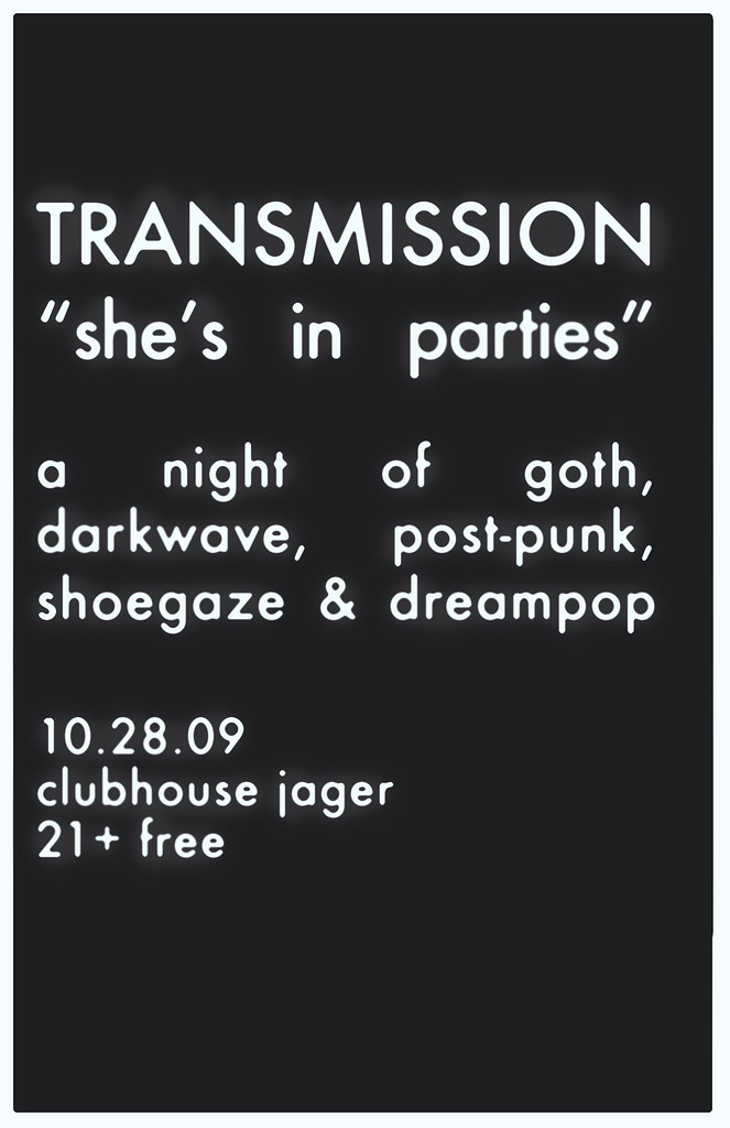
A good rule of thumb is to always keep in mind the format you're designing for. We never print out the Transmission posters; they are always viewed in web. So, This looks pretty cool online. In print, I must admit, it looks pretty boring.

Boring even for me, and I love boring things.

But, I really love this poster. Jake gave me the assignment early on; a gothy Halloween night. He said: Think Bauhaus or Joy Division. I've never listened to Bauhaus, but I decided to use them as inspiration.

When I think of them, I think of the one song I know by them: "Bela Lugosi's Dead." And from the knowledge I gained watching Ed Wood, it gave me enough to know he was a silent film star--Dracula, to be exact. Any student of film should know that, duh. So. Silent film era. I wanted to make a poster that resembled a silent film title card. I googled that, and found this gem:

I also kept in mind what I know about Joy Division's music, which is that it's very minimal and detached; sparse. So, this bit of inspiration was perfect: minimal, dark, ominous and gothic.

I chose a good sans serif that'd been around in the 20s (Futura Medium), and put it on a not-exactly-black background, with a not-exactly-white border. I justified the type because I couldn't help but notice that was also done to my inspiration source. It was a bit too crisp, so I applied a noise filter in photoshop (they can actually be useful sometimes), and used the airbrush tool to give the type a nice eerie glow. It was definitely back to basics on this design.

But again, it only has impact online. Trust me.

:TRANSMISSION: A night of "Celebration"


I'll come right out and say it; I'm not wild about this poster. Jake combined a Top 40 80s Night with the 'celebration' of Madonna's new album. Madonna=80s icon. That's fair. But also he wanted me to use the album art, which is very UN-80s. It was a bit grungy, I thought. Nevertheless, I got to work, trying to mimmick the album art throughout the poster. It's kind of beaten down and torn up. I also added some paint splatters. That, I suppose, was the one unifying element between the Madonna album cover and the 80s. I seem to remember paint splatters being somewhat fashionable?

I don't know, I only lived two years in the 80s.

Anyway. The graphic took me a good long while in Photoshop. I downloaded several stock paper images off of
Deviant Art (which is invaluable for projects like these) and got down to business. I don't think I did anything wrong execution-wise. I'm just not crazy with the aesthetic. Fortunately for me, people really liked it. But... Those kinds of things are only good in moderation. If you don't like what you do, no matter what others think, you should reconsider what you're doing.

I tried to make the type as 80s as I could. Hot pink with a bit of drop shadow and a little sheen. And to give the whole design dimension, I absolutely had to get the type behind the paper. Just a little.

Since the "Celebration" album art was already so graphic, I guess that's what I struggled with. How to add to something that was already so loud? It was a struggle. This may be the most NON-minimal thing I've done. I think there's possibly too much visual impact.

But. It ain't bad work.

:TRANSMISSION: Generic poster


I can't remember exactly what inspired me to make this poster. I think it was probably a combination of this:

(which is continuing to influence me.. Not that, what, a month? is that out of the ordinary)
And the acquisition of one of the most exquisite fonts in existence: ITC Avant Garde Gothic.
Seeing that Interpol poster made me want to do something simple, with clean lines that expressed movement AND the illusion of sound. I also thought that I might want to use it for a Joy Division-themed poster someday.

But alas, I got impatient.

I don't have a lot of color in my everyday life. But I do design with it. It's so expressive, and when used minimally, it can have a really strong impact. TRANSMISSION is a night of sound and movement. I like the idea of visually communicating sound waves. So, that's what I did here. It did start out as something slightly more complicated and over-thought, so I toned it down, so to speak. Those damn colored strands were much trickier than they may appear.

I gave it to Jake as a printed piece, saying simply he could do whatever he wanted. It was mostly a little gift to him for letting me do design for him.

And he agreed that it did have a Joy Division essence.

:TRANSMISSION: Transmission a go-go


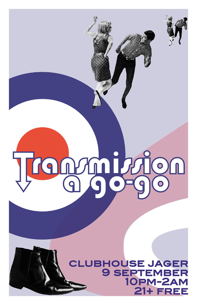
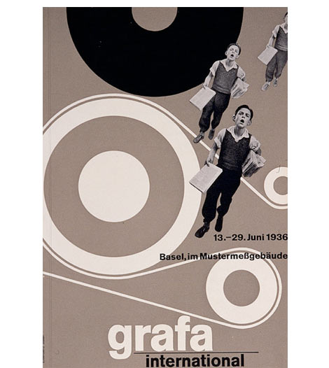
I was really, way too excited when Jake told me he was doing a mod night. I already knew exactly what to do, because a few weeks prior I spent a good couple hours looking online, collecting pictures of Mods. And, I had a lot to live up to after the John Hughes poster. I knew I wanted to use this as my inspiration:

I loved the repetition of the photograph, and the interesting movement of the shapes. Admittedly, this IS a poster from the 30's. But, I can definitely see the modernism in there. Swiss designers in the 1930s were cutting edge. Obviously--they are still influencing people.

Anyway, I struggled with the right image to use and to repeat. I made a version with a woman but Jake sent me a photo he liked and that people associate with him. It was tough--being that it was so small, but luckily it worked out. I just wish now I would've put a duotone on them instead of a black & white filter. Oh well.

Working on the type was also a bit of a struggle. I'm self-taught, mind you, so applying strokes and making character outlines for me was a journey. I associate the arrowed-type with the mid-60s. The original font was Bauhaus. One of my instructors said today that every font has a purpose. And while I normally don't like the Bauhaus font, it definitely had its place here.

Oh, and Beatle boots. You can't go wrong with those.

:TRANSMISSION: John Hughes Tribute


Where to start with TRANSMISSION? I started going there in May, and everything sort of clicked. It's located at a fantastic bar, and the DJ, Jake Rudh plays great, great tunes all from my favorite artists. Started going every week, became a member of the Facebook group and became friends with Jake. I mentioned to him that I do design and if he wanted some flyers I could totally hook him up.

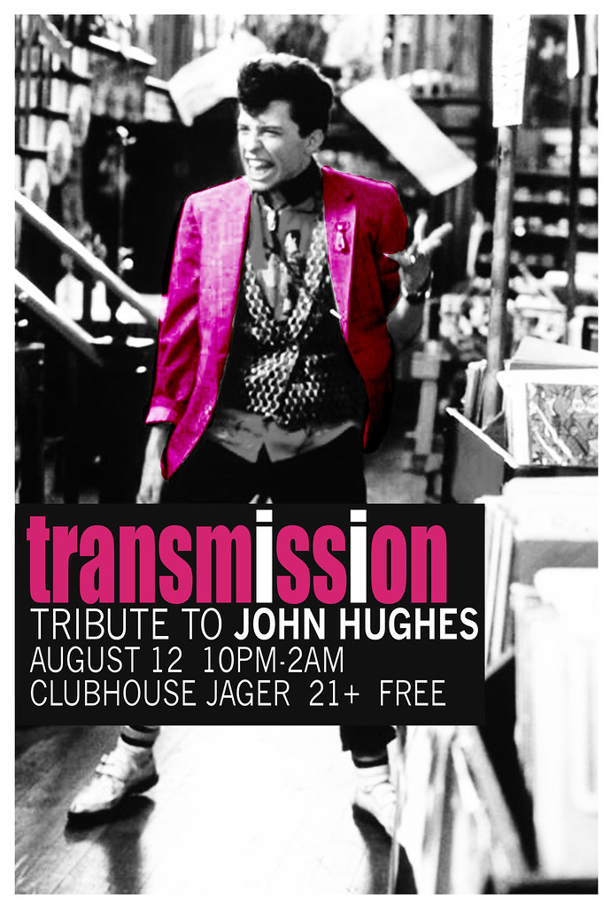
This is the first one I did, and it was sad that John Hughes had to die for me to get my foot in the door, but otherwise I might not have become is go-to gal for design. So. A mixed blessing I suppose.

Anyway. The concept is easy enough. John Hughes movies have a heavy musical influence, and I wanted to use an image that conveyed that. I chose this one of Jon Cryer in Pretty in Pink, because Transmission IS a dance night, and he is dancing (If I would've found anything decent of the kids dancing in Breakfast Club, I would've used those. But I didn't.) It also gave me the opportunity to take inspiration from this poster:


The things that are difficult about a design are never what you would expect. the thing that gave me the hardest time with this particular one was finding the right color pink. I was going to have to eventually turn it into a JPEG and that compressed all the good pink right out of the design, so I had to keep going darker. Not only that, but since I applied a filter to the color on the jacket, it looked darker than the type. But, the color had to be the most eye-catching thing. And I think I struck a balance here.

Stay tuned for more TRANSMISSION posters