15.10.10

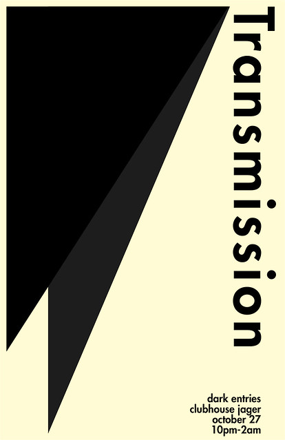
:TRANSMISSION: Dark Entries


The Cure night almost wasn't going to happen, and this would've been the sole goth-y night at Transmission in October. Luckily, Jake decided to go with The Cure (which meant I got to use the poster I'd already made), and think of something different for this night. Like last year's Transmission Halloween, this one is named after a Bauhaus song. I didn't know the name of the night before I made this, so I just did something that felt like Goth and Post-Punk and minimal. I was really feeling October when I made it, basically. I don't know why, but Futura is a great "dark" font without being grunge, which seems to happen a lot, I've seen (at least with Goth nights in Minneapolis).

In terms of the design itself, I drew inspiration from the following:
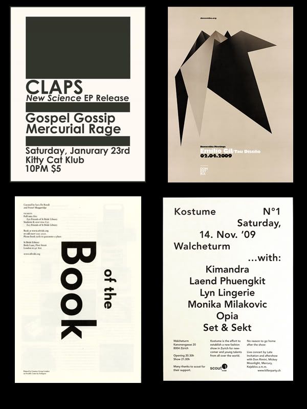

Which, when you look at all those, you might wonder if I ever come up with anything on my own. Well, I do. It's not like I keep one image open and constantly look to it when I'm in InDesign. I simply draw bits of ideas from several things and blend it. That's what creative problem solving is all about. When I see something that inspires me, I not only save it to a folder on my computer, but I somehow lock it away in my brain, so that when I need to come up with an idea, I can just open the filing cabinet in my brain and pull something out pretty quickly.

Anyway, the whole Bauhaus movement was also a huge influence here. It makes sense, after all (and I think Bauhaus couldn't have chosen a better name for their band).

This took about 10 minutes and I did it to relax after dealing with a bunch of business-type BS all day. It's great that my escape from work is more work.

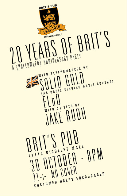
:BRIT'S PUB: 20 Years of Brit's


So this is kind of a cool thing. I got the nod from Jake (obv) to do a poster for this free event at Brit's Pub at the end of October (a halloween party that coincides exactly with their 20th anniversary).

For someone like me (a raging Anglophile), Brit's Pub is a paradise, and I'm always happy to do work for a place like that (who not only PAYS me, but gives me a gift certificate to their bar).

I've been, like, the busiest person ever lately with school and basically feeling like a small business owner. I did a first draft of this poster pretty quickly one day, and it was fine, but, admittedly, shite. It looked gimmicky, and I think part of me knew what I was doing. I didn't have a ton to work off of, as far as guidelines. Jake suggested the Union Jack in black and orange, and the Brit's 20th Anniversary logo. I don't have a copy of the original version anymore, but I kind of made it look 1800's Naval/Pirate-y. I sent it along, and was told to make it "sexier, edgier." In a moment of desperation, I asked Jake to tell me what to do, since I was feeling so creatively stretched.

He told me to maybe do some silhouettes, which I was very hesitant to comply with because I feel like I have done it to death. Instead, I decided to ditch my current fonts, and switch to something sexy and slim, and hell, why not a diagonal alignment. It was hard trying to work the logo in on a slant, but I ended up making work.

If I may be perfectly honest and abandon all modesty, I think this is probably my best typographical work ever. I love the font choices I made, and the two alignments that separate the performers info from the rest of it. The logo is prominently featured at top (another thing they requested) and I still kept the union jack, though smaller, and it doesn't look bulky or tacked on. I feel the alignment (on a slant) makes the whole thing much more interesting but still easy to read. I wish I could use this template for everything. I'm glad to do it for a venue who will display it, and one that I like so much. Not only that, but Solid Gold is awesome, and it makes me giddy to have made something with their name on it.

Stuff like this really makes me proud to do what I do.

:TRANSMISSION: In-Between Days: A Night for The Cure


This was supposedly Jake's first-ever night dedicated to The Cure, which I find shocking. They're such a great band that has such a huge impact on the night. He first alluded to the night in the Summer time, which excited me, and provoked me to do this poster early on.

The Cure were one of the first bands to do the Goth thing. I wanted to play to that look, since I really LOVE the music they made during that phase. For some reason, Goth is heavily associated with victorian dress, so I made a sort of old fashioned Victorian style poster with a silhouette of Robert Smith (whose hair is really that ridiculous). I had those little vector flourishes leftover from a couple years ago, and figured they'd go well.

I originally was probably going to do something more, with a baroque-style background, just super fussy and ancient looking. But, I think my OCD would get the best of me in that situation and I'd end up editing everything.