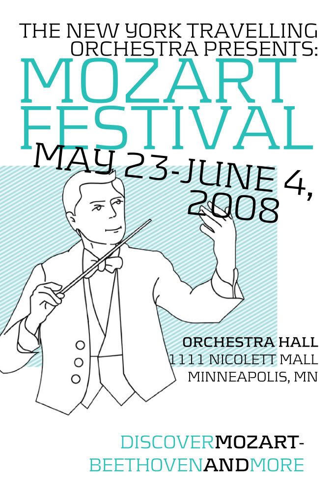
This was an assignment for my Layout & Design 1 class in Spring 2008. Would you believe it, I actually failed that course the first time around? Yeah.
I started the assignment by making 3 posters for the subject and decided on this one to present to the class for critique:

Which, even a year and a half later, still doesn't look so bad to me. But I can see why is was met with harsh criticism. I didn't think hard enough about the assignment; I was trying to make something fun for me, without considering that the subject matter must help to dictate the style.
Also, somebody compared it to the movie Juno, which made me want to rip it to shreds.
They did like some things about it, though; the color, and the tilted type.
So I worked a good 5 hours on the second draft. For me, and design, that's a lot of time spent working. I generally work fast while simultaneously doing my thinking and conceptualizing. I kept the bright color blue and the angled text. Everybody else in the class who used an image of Mozart used this:

Probably because it's one of the only images of him you can find on the web. I googled "Mozart bust" though and found this amazing silvery one. The victorian flourish is from the site vectorstock.com, so I paid for it, and also the baroque background. It's surely the most high-production thing I've designed. Anyway, here's how it turned out:

My hard work paid off and was received really well. It remains my favorite design because of what it took for me to look past my pride in my initial work and listen, how much patience I put into it, and the risks I made to make it stand out so much.
Lessons I've learned in design:
It's really amazing how much you can learn in a day or a week, and how much your style can change in that time, too. It's amazing how one second you look at something you've made and think "yeah, that's great." and then you show it to someone, they point a few things out, and within an hour you think it looks like utter shite.
I don't think I'll ever stop learning.


You second attempt is amazing! Hell, I couldn't have even done the first. You're so talented!
ReplyDelete