4.11.09

:PERSONAL: There is a light...


I. Love. The Smiths. And this is one of my favorite songs of all time. I could listen to it for days at a time. I combined my love of all things British with this set of lyrics. I think subconsciously it was inspired loosely by this. I can't say a lot about this. It was pretty quick (again to avoid homework), but there's still a lot of love in there. Also, I don't know how, but it seems to be one hell of a popular piece on my Flickr page. That's actually good, because I made this with people like me in mind, who'd just loooove to buy a print of this and put it in a cute little frame. Once I get THIS, I'll be able to start a little business.

Stay tuned.

:PERSONAL: Thursday Afternoon


Lately all my good work has been borne out of an avoidance of homework. Hm. I wonder what will happen when I'm done with school. Luckily, the end isn't anywhere near, so I'm good for now.
My work station is situated in front of a big window, where I can see from our 3rd floor apartment. On Thursday it was a miserably cold and rainy day (though not cold enough for our heat to be on..) and I saw a guy walking on the street, wearing all black, with a bright blue umbrella. I thought that was pretty striking, so I decided to draw it up quickly in illustrator. It's cute right?

:ACROSS THE BOARD:


I've always been fascinated by Space. The first thing I remember wanting to be is an Astronomer. I was asked by local radio host DJ SLT to create a poster for his show, ACROSS THE BOARD, based slightly off of the Space Oddity poster I did. So, I knew I was going to do (my favorite) the colored lines, which I still maintain symbolize sound, with a hint of "exploration."

Colored lines=music.

He's also, like, the biggest David Bowie fan EVER. I'm not even exaggerating. He's an inspiration to young Bowie fans everywhere, such as myself. David Bowie is also very fascinated with space. It's pretty obvious to anybody who's heard any of his songs. The moon was a late addition, because I felt the poster needed a big striking image, and instead of something abstract, I decided on the Moon. It represents the late hour that his show airs during, David Bowie, and a mutual love of Science Fiction. He requested the stars, which I felt was well-needed. The font is ITC Avant Garde, which is becoming synonymous with the more spacey stuff I've been doing. Overall, I think this is another step for me in my design. I think this poster is as much for me as it is for him. Great fun. I'm real proud of it.

20.10.09

:PERSONAL: Blue Monday


Not sure why I wanted to portray this very 80s dance song in a retro 60s poster design, but I just did. It was simple, took about 15 minutes. Although, I hoped for a bit more effect on the type. It's supposed to look like it went through an offset press. It's a bit hard to make out.

New Order is good.

:PERSONAL: Space Oddity


I feel like talking about this design would take more energy than it did to make it. It wasn't hard. On the contrary, it was SO much fun. But it just took a long time, and it took even longer to get a solid concept.

I started with making a stream of colored blocks. But the colors looked stupid and the blocks didn't have a good flow. I tried over and over with them. Then I started making a big color chart in illustrator--I got a bit sidetracked. But it sort of gave me a bit more focus, and I thought I better just do what I know--and I went back to the colored lines. But it wasn't going to be enough of an impact, so I made three of each color.

Wait, wait... I'm getting ahead of myself.

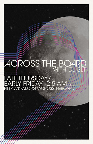
The concept I wanted was a 70s-era Sci Fi cover of David Bowie's Space Oddity. The font again is Avant Garde and the lines give a sense of cosmic journey. The background I fashioned out of photoshop brushes and a paper texture. The little man? Also a brush. But I'm not sure where I got this from, I just think having a little ambiguous character gives it that 70s vibe. Don't ask me why, because I don't have much evidence for that.

It all sort of formed organically. I didn't even start out with this idea in mind. It WAS going to be something different, and I'm glad I changed it. I'm really proud of this. The only thing I regret is that it's not FOR anything. It's simply there to be seen by anyone who comes across it. Designing for personal enjoyment is a double-edged sword.

Although if I do generate enough interest, I'd love to sell this as a print.

And "D.R. Jones" is David Robert Jones aka David Bowie. Duh.

:PERSONAL: Let's Dance


Most of the work on here IS fairly recent. But I'm now moving into even more recent territory. I can't help but think I'm evolving with each and every design. I think lately I've just been in a good groove.

Speaking of groove. I love David Bowie. I wanted to make a poster similar to the (Good Day, Sunshine) one, with a simple "Let's Dance" and the illustrated red shoes. But, I figured, why not make it a bit more kitschy? Dance step diagrams are great and simple, and yes they are design. Whether you think so or not. I actually used a diagram done by Andy Warhol for reference--which is cool, because Bowie loved Warhol, and he even played him in a movie. So after that was just finding a good balance. With this amount of stuff in a design, it doesn't work to center it, so I had to find a way to even out both sides. And NOT have a big gaping hole in the right-center. In any case, it was fun as hell to do it. You might be able to tell, I love the 60s. It was a great era of design.

:PERSONAL: Her Majesty


To say I am an anglophile would be an understatement. I am an angloMANIAC. I probably care a bit too much about the British Royal family for being an American. I also love The Beatles, AND my logo is a Queen's crown. Sooo what better way to combine the three than to make a design? It looks like it's screenprinted, jah? Well, that's intentional. Also, putting a half-tone filter on the image makes it look less pixelated... Which it was, because I had to make it so big.
I also made this around the same time as the Good Day, Sunshine one. Can you tell? I love Univers.