15.1.10

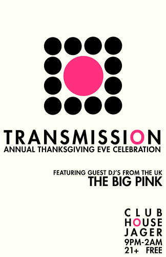
:TRANSMISSION: Thanksgiving Eve


I'm a bit behind, it's true. I think this might be my favorite Transmission poster that I've done. It's simple, modern, clean and striking. And it makes sense. Quick description:

The UK band The Big Pink were going to be Guest DJ-ing for the last hour and Jake wanted that to be the focus of the poster. Without making anything too obvious, I decided to use circles (because I love circles) to visualize a turn table (with a BIG PINK circle in the middle). It's also very modern, kinda like a marshmallow couch. I'm also a bit in love with my continuation of the pink circle in all the O's. Yeah okay, so I'm a bit in love with my whole design. Am I wrong?

:PERSONAL: How to Dress like Me


I must qualify the fact that I am a bit vain. I love the way I dress, even though it is often very simple and casual. Lots of black and grey. BUT my outfits are picked with purpose, and always coordinated. One day I felt like it was necessary to give a rundown of my essential uniform, so I illustrated this little guy and decided to get cheeky. I like my clothes.

:PERSONAL: Everyday is like Sunday


Morrissey. Enough said.

:THE MIDNIGHT MOVIE SOCIETY: Clue


The Midnight Movie Society was formed by Jake Rudh (DJ at Transmission) and Vita.MN (the weekly magazine of the Minneapolis Star Tribune). Apparently they had a graphic designer but didn't like the direction so they tapped me. Me! The Star Tribune is the biggest Newspaper in the midwest, and there are hundreds of designers in the city, and I got a personal call. It's not such a bad thing.

But, about the work. I was given about 24 hours to complete this. Probably the first time I've had such a strict deadline. Luckily, I know a lot about the movie Clue. But it was hard as hell to come up with a concept. The only piece of art direction I got really was to base it off the Original Movie Poster. And, as it turns out, I love colored lines. There really wasn't much to go off of in the way of stock images, and I WAS getting paid for this, so I knew I had to create my own art. I went about tediously tracing lo-res stock images. I wasn't worried about perfection because where do I take inspiration from? The 60s. And what is so great about 60s illustration? It's imperfect and non-complex. Next, the lines. At first they were going every-which-way and when I submitted it there was a suggestion to make them all lead to the title, and possibly with little weapons on them. I originally thought about doing something with the weapons, but then I didn't. Anyway, with about 30 minutes to the deadline, and with a rapidly dying computer battery, I was lucky to find an illustration online of the Clue weapons and I did a livetrace in Illustrator. This is the finished product. I'm proud of it, but at the same time, sick of looking at it. It was published in several issues of vita.mn and I got a nice little sum; my first paid gig! It was a very hard, very stressful project. I'd never felt so much pressure to do well. Tears were shed for sure. Thanks to Jake for continuing to have faith in me and get me work!

4.11.09

:PERSONAL: There is a light...


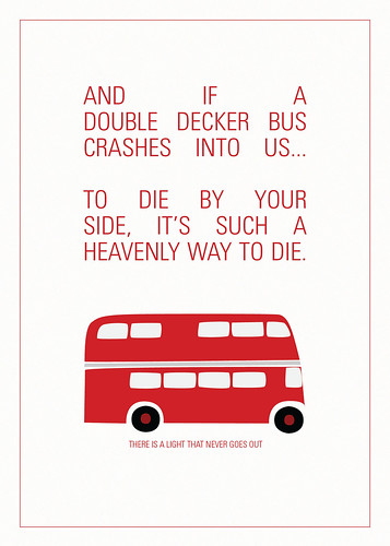
I. Love. The Smiths. And this is one of my favorite songs of all time. I could listen to it for days at a time. I combined my love of all things British with this set of lyrics. I think subconsciously it was inspired loosely by this. I can't say a lot about this. It was pretty quick (again to avoid homework), but there's still a lot of love in there. Also, I don't know how, but it seems to be one hell of a popular piece on my Flickr page. That's actually good, because I made this with people like me in mind, who'd just loooove to buy a print of this and put it in a cute little frame. Once I get THIS, I'll be able to start a little business.

Stay tuned.

:PERSONAL: Thursday Afternoon


Lately all my good work has been borne out of an avoidance of homework. Hm. I wonder what will happen when I'm done with school. Luckily, the end isn't anywhere near, so I'm good for now.
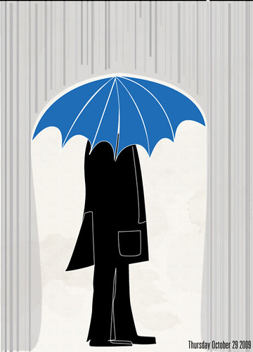
My work station is situated in front of a big window, where I can see from our 3rd floor apartment. On Thursday it was a miserably cold and rainy day (though not cold enough for our heat to be on..) and I saw a guy walking on the street, wearing all black, with a bright blue umbrella. I thought that was pretty striking, so I decided to draw it up quickly in illustrator. It's cute right?

:ACROSS THE BOARD:


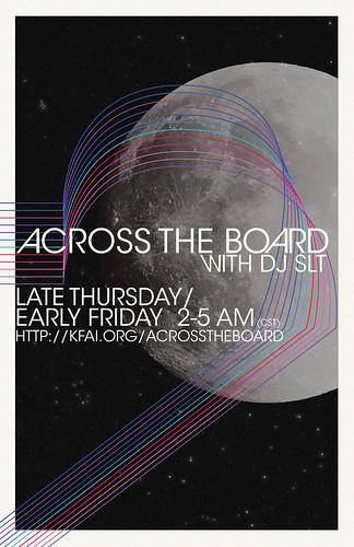
I've always been fascinated by Space. The first thing I remember wanting to be is an Astronomer. I was asked by local radio host DJ SLT to create a poster for his show, ACROSS THE BOARD, based slightly off of the Space Oddity poster I did. So, I knew I was going to do (my favorite) the colored lines, which I still maintain symbolize sound, with a hint of "exploration."

Colored lines=music.

He's also, like, the biggest David Bowie fan EVER. I'm not even exaggerating. He's an inspiration to young Bowie fans everywhere, such as myself. David Bowie is also very fascinated with space. It's pretty obvious to anybody who's heard any of his songs. The moon was a late addition, because I felt the poster needed a big striking image, and instead of something abstract, I decided on the Moon. It represents the late hour that his show airs during, David Bowie, and a mutual love of Science Fiction. He requested the stars, which I felt was well-needed. The font is ITC Avant Garde, which is becoming synonymous with the more spacey stuff I've been doing. Overall, I think this is another step for me in my design. I think this poster is as much for me as it is for him. Great fun. I'm real proud of it.